Timeline
15 weeks
Team
Solo Project
My Role
UX Researcher
UX Designer
Scope
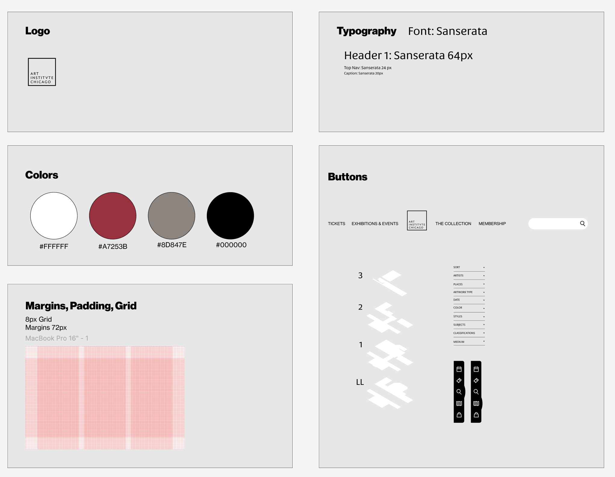
User Testing, Information Architecture, Paper Prototyping, Medium Fidelity, Style Guide, Visual Design.
PROBLEM
The Art Institute of Chicago’s website lacks intuitive navigation and engaging content, making it hard for users to find specific artworks and feel inspired.
SOLUTION
Implement an intuitive navigation system with an interactive gallery map feature, streamlined filters, and enhanced content displays on the homepage to improve user engagement and make artwork discovery easier.
Dynamic Homepage
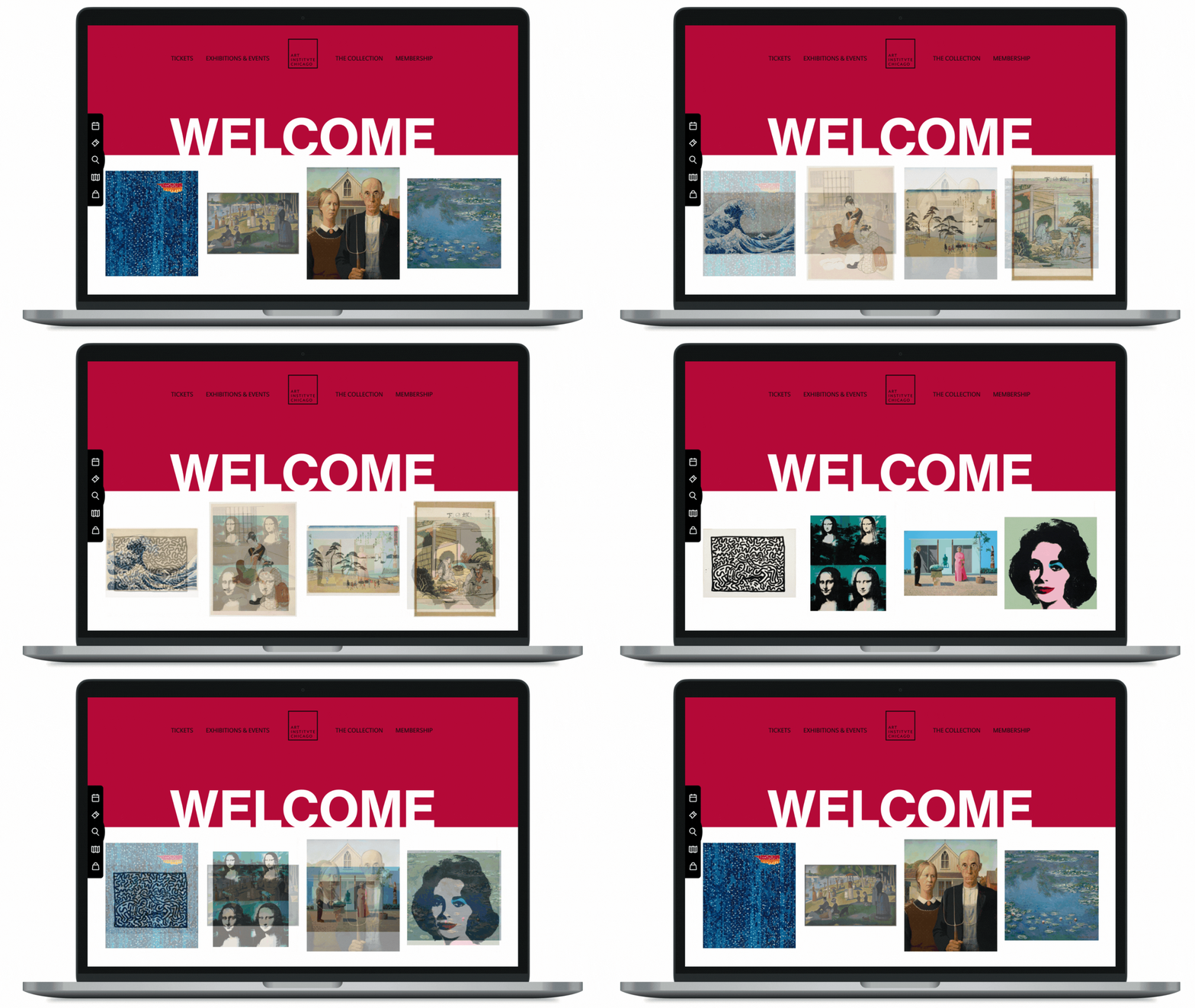
A homepage that showcases personalized art recommendations, offering users a fresh and customized experience based on their previous interactions.
Interactive Map
An interactive map enabling users to explore and discover artwork by gallery location.
Content Layout
Streamlined "The Collection" tab to consolidate filtering options on a single side, simplifying navigation and reducing user confusion.
USER testing
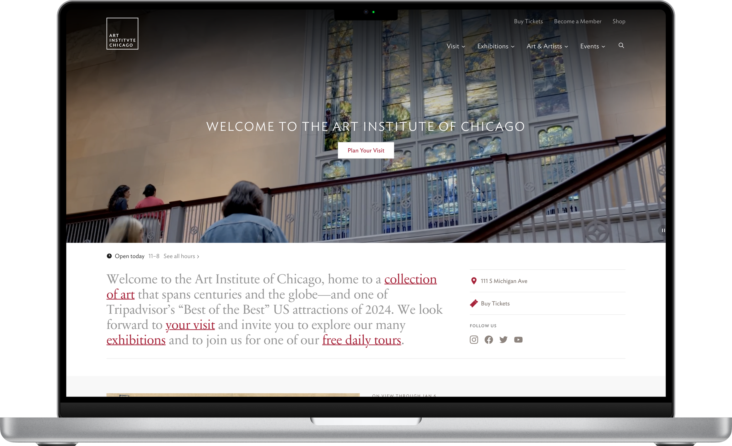
Current Website
I conducted testing with 1 frequent visitor and 2 first-time users of the Art Institute's website. The key insights revealed that regular visitors value direct access to specific artworks and efficient search functionality, while newcomers are interested in interactive guides, intuitive navigation, and visually engaging features that enhance discovery. These insights highlighted the need for a user-centered design that caters to both audiences by balancing ease of use with inspiring content.
the main insight
The primary insight from user testing is that both frequent visitors and first-time users of the Art Institute's website seek a digital experience that is intuitive, visually captivating, and encourages exploration and learning.
major insights
Accessibility and Ease of Interaction
Visitors value an interface that is straightforward, with quick access to both popular and lesser-known artworks, allowing all users to navigate and explore the collection effortlessly.
Engagement through Interactive Features
Both new and frequent users are drawn to features that allow for deeper engagement, such as interactive guides, virtual tours, and personalized recommendations, making the experience more immersive.
Balancing Education and Inspiration
While regular visitors appreciate detailed information on artworks, first-time users prefer a mix of educational content and inspirational visuals that introduce them to art in an approachable way.
INFORMATION architecture
PAPER PROTOTYPING
Quickly translated concepts into a paper prototype.
I designed a homepage that dynamically showcases artwork tailored to user preferences, an interactive map feature for discovering art by gallery location, and an improved artwork detail page with enhanced filters for a more seamless browsing experience.
medium fidelity
Redesigned the homepage for improved usability and visual balance.
I shifted the interactive map and search to a side panel for a less intrusive experience, center-aligned the logo for a more cohesive layout, and streamlined the artwork display by reducing it to a single row of four pieces to avoid overwhelming users.


